
Start with HTML and CSS Fundamentals
To begin your journey into responsive web development, it’s essential to establish a strong foundation in HTML and CSS. HTML serves as the backbone of your web content, providing structure and semantics. CSS, on the other hand, is responsible for the presentation and styling of your web pages. Understanding these two languages is akin to learning the alphabet before you can write a compelling story.
HTML allows you to define the elements that make up your web page, such as headings, paragraphs, lists, links, and more. It also provides the structure for creating forms, embedding multimedia, and organizing content into sections and divs. Without a grasp of HTML, you won’t have a framework to build upon.
CSS, in contrast, is where you bring your design vision to life. You can define colors, fonts, spacing, borders, and layout properties using CSS. Learning CSS not only involves styling individual elements but also understanding how selectors, classes, and IDs work to target specific parts of your HTML document.
Responsive web design relies heavily on CSS as you’ll be using it to create flexible layouts and apply styles that adapt to different screen sizes and orientations.

Embrace the Concept of Responsive Design
Responsive design is the guiding philosophy behind creating web experiences that adjust to the user’s device, whether it’s a small smartphone, a tablet, a laptop, or a large desktop monitor. This concept hinges on the idea that a single website should provide an optimal viewing and interaction experience across various platforms.
To achieve this adaptability, you’ll delve into fluid layouts, media queries, and flexible content. Fluid layouts enable your web page to expand or contract smoothly based on the screen’s dimensions. Media queries, a fundamental aspect of responsive design, allow you to apply specific CSS rules when certain conditions, such as screen width or device type, are met. This conditional styling ensures that your website’s design remains cohesive and usable across diverse devices.

Adopt the Mobile-First Approach
The mobile-first approach is a strategic mindset that recognizes the dominance of mobile devices in today’s digital landscape. When you begin designing for mobile devices first, you prioritize simplicity, performance, and user-focused design. This approach compels you to make deliberate choices about what content and features are essential, resulting in a streamlined and efficient user experience.
Starting with mobile design also encourages you to think in terms of touch interactions, limited screen real estate, and slower network speeds. Once you’ve nailed the mobile experience, you can then progressively enhance your design for larger screens, adding more complex features and layouts as the screen size increases.
Master Fluid Layouts
One of the core principles of responsive web design is the use of fluid layouts. Instead of fixed pixel measurements, you’ll employ relative units like percentages and ems. This approach allows your web page to dynamically adjust its layout based on the screen’s width.
A fluid layout ensures that your content flows gracefully, filling available space proportionally without causing horizontal scrollbars or layout breakage. Whether a user views your website on a tiny smartphone or a massive desktop monitor, the content should adapt and remain readable and visually appealing.
Explore CSS Grid and Flexbox
To gain greater control and precision over your web layouts, delve into CSS Grid and Flexbox, two modern CSS layout systems.
CSS Grid is a two-dimensional grid system that enables you to create complex layouts with rows and columns. It’s particularly useful for arranging content in a grid, making it an excellent choice for creating responsive designs where content may need to reflow based on screen size.
Flexbox, short for the Flexible Box Layout, is designed for one-dimensional layouts. It excels at aligning items within a container along a single axis, which is handy for creating responsive navigation menus, flexible card layouts, and vertically centered content.
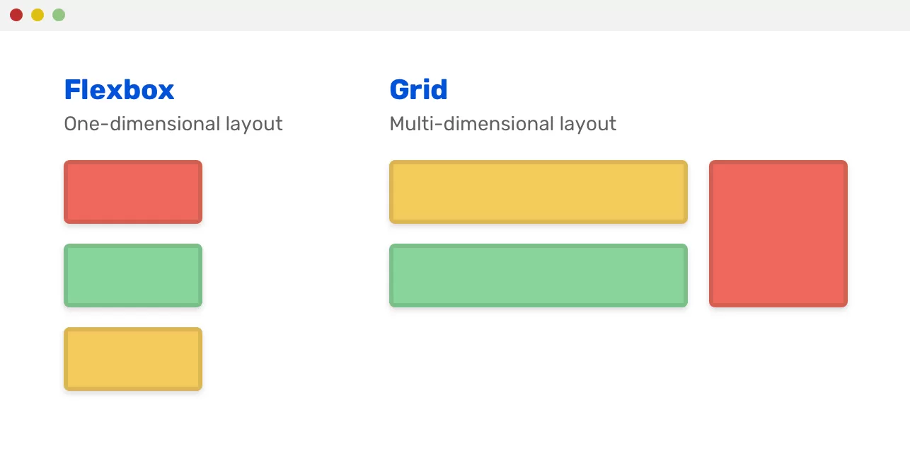
Both CSS Grid and Flexbox offer powerful tools for crafting responsive and dynamic designs that gracefully adapt to various screen sizes and orientations.
It may be useful for you: best ecommerce website builder for small business
Handle Images and Media Responsively
Images and media elements play a crucial role in the visual appeal of your website, but they can also be a source of performance bottlenecks if not managed properly in responsive web design.
To ensure that images and media adapt seamlessly, optimize them for different screen resolutions and sizes. This optimization involves serving appropriately sized images based on the user’s device and network conditions. Techniques like the “srcset” attribute and the “picture” element in HTML enable you to provide multiple image sources, allowing the browser to choose the most suitable one.
By implementing responsive image strategies, you can enhance the loading speed of your website, reduce data usage for mobile users, and ensure that images always look their best, regardless of the screen.
Implement the Viewport Meta Tag
In responsive web development, the
<meta name=”viewport”>
tag is a vital tool for controlling how your web page is displayed on mobile devices. This tag enables you to adjust the viewport’s behavior, influencing aspects like scaling and zooming.
Without the viewport meta tag, mobile browsers may attempt to scale your web page to fit the screen, potentially causing layout issues and readability problems. By including this meta tag in your HTML, you can specify the initial viewport dimensions and prevent unwanted scaling, ensuring your design looks as intended on mobile devices.
Test and Debug Across Devices
Testing and debugging are integral parts of the responsive web development process. Even the most well-designed responsive websites may encounter unexpected issues on various devices, browsers, and screen sizes.
Leverage browser developer tools to inspect and modify your website’s layout and styles in real-time. Most modern browsers provide responsive design modes that simulate different screen sizes and orientations, making it easier to spot layout inconsistencies and adjust styles accordingly.
Additionally, consider using online testing tools and emulators to assess your website’s performance across a wide range of devices and browsers. Testing on actual devices whenever possible is also valuable to ensure that your responsive design functions as intended in the real world.
By thoroughly testing and debugging your responsive web projects, you can deliver a consistent and user-friendly experience to all visitors, regardless of their chosen device.
Explore Frameworks and Libraries
While a solid understanding of HTML and CSS is essential, you can expedite the development process by leveraging CSS frameworks and libraries designed specifically for responsive web design.
CSS frameworks like Bootstrap and Foundation provide pre-designed UI components, responsive grid systems, and CSS styles that you can easily incorporate into your projects. These frameworks offer a foundation to build upon, saving you time and effort while ensuring a consistent and responsive design.
Alternatively, CSS-in-JS libraries like styled-components enable you to encapsulate your component’s styles, making it easier to create responsive and maintainable CSS code within your JavaScript-based applications.
Prioritize Progressive Enhancement
Progressive enhancement is a fundamental concept in web development, particularly in the context of responsive design. It advocates for building a solid, functional foundation that works across all devices and browsers before adding enhancements for modern technologies and features.
Start by creating a basic, accessible version of your website that functions well on older browsers and devices with limited capabilities. Ensure that core content and functionality are available to all users, regardless of their device or browser choice. Then, progressively enhance your design by adding features, improving styling, and optimizing performance for modern devices and browsers.
Progressive enhancement not only ensures a broader reach for your website but also makes it more resilient to changes in technology and user preferences.
Optimize for Performance
Performance optimization is a crucial aspect of responsive web development. The responsiveness of your website
is not solely about adapting to different screen sizes; it also involves delivering a fast and efficient user experience.
To optimize your website’s performance for responsive design:
– Minimize file sizes by compressing and optimizing images, scripts, and stylesheets.
– Reduce the number of HTTP requests by combining and minifying files.
– Implement lazy loading for images and other non-critical resources to defer their loading until they are visible in the user’s viewport.
– Utilize browser caching to store static assets on the user’s device, reducing the need for repeated downloads.
– Consider using content delivery networks (CDNs) to distribute assets geographically, reducing server response times.
Efficient performance optimization ensures that your responsive website loads quickly on mobile devices, providing a smooth user experience even with limited network connectivity.
Tackle Responsive Typography
Typography is a critical element of web design, and it plays a significant role in responsive web development. Text should be legible and aesthetically pleasing on screens of all sizes.
To achieve responsive typography:
– Use relative units like “em” or “rem” for font sizes to ensure text scales appropriately with the layout.
– Employ media queries to adjust font sizes, line heights, and spacing as the screen size changes.
– Consider responsive font loading techniques to prioritize critical fonts and ensure rapid text rendering.
Responsive typography ensures that your content remains readable and visually appealing on various devices, from mobile phones to large desktop monitors.
Ensure Accessibility
Web accessibility, often abbreviated as “a11y,” is an integral part of responsible web development. It involves designing and coding websites to be inclusive and usable by individuals with disabilities, such as those with visual, auditory, or motor impairments.
To ensure accessibility in your responsive designs:
– Use semantic HTML elements to provide proper structure and meaning to your content.
– Include descriptive alt text for images to convey their content to screen readers.
– Ensure keyboard navigation and focus indicators for interactive elements.
– Test your website with accessibility tools and screen readers to identify and address any issues.
Accessible design not only makes your website compliant with legal requirements but also broadens your audience by making your content available to all users.
Utilize Version Control
Version control is an essential tool for web developers, and it becomes especially valuable when working on responsive web development projects. Version control systems like Git enable you to track changes in your code, collaborate with others seamlessly, and easily roll back to previous versions if issues arise.
By utilizing version control, you can maintain a clear history of your project’s development, collaborate with team members or open-source contributors, and ensure that your responsive design remains consistent and well-documented throughout the development process.
Practice and Build Projects
Learning responsive web development is a hands-on journey, and practical experience is invaluable. As you gain knowledge and skills, apply them by working on real projects. Start with small websites and gradually take on more complex challenges.
Consider creating a portfolio of responsive web projects that showcase your abilities to potential employers or clients. These projects serve as evidence of your proficiency in building websites that deliver a superior user experience across a wide range of devices and screen sizes.
Practice not only reinforces what you’ve learned but also exposes you to various scenarios and challenges, helping you grow as a responsive web developer.
Stay Informed and Keep Learning
The field of web development is dynamic and ever-evolving, with new technologies and best practices emerging regularly. To excel in responsive web development, make a commitment to continuous learning and staying informed about industry trends.
Follow web development blogs, attend online courses, webinars, and conferences, and engage with the developer community on forums and social media platforms. By staying up-to-date, you’ll be well-equipped to adapt to new technologies, tackle fresh challenges, and deliver the best possible responsive web experiences.
In conclusion, mastering responsive web development is a multifaceted journey that begins with a strong foundation in HTML and CSS. As you progress through the concepts and techniques outlined in this guide, you’ll gain the skills needed to create websites that gracefully adapt to different devices and screen sizes. Whether you’re designing for smartphones, tablets, or desktops, responsive web development ensures that your content reaches and engages your audience effectively, providing a seamless user experience across the digital landscape. So, embark on this exciting journey, practice your skills, and continue learning to become a proficient and sought-after responsive web developer in today’s ever-evolving web ecosystem. Your contributions will shape the future of digital experiences.

Lastly
So, seize the opportunity, build remarkable responsive websites, and contribute to the digital landscape, knowing that your skills will shape the future of web experiences. Your journey in responsive web development is just beginning, and the possibilities are boundless with VegaTekHub by your side. Happy coding!

